|
|
Graph Types | PopChart Server Reference 4.0.5 |
Listed below are the Time graph subtypes.
The graph depicted in Example 13.10 is a Time Line graph. In a Time Line graph, all of the data items in a series are connected by the same line.
To create a Time Line graph in PopChart XML, you should set the SubType attribute of Graph to Line. The tag below shows how this is done.
<Graph Name='graph' Type='Time' SubType='Line'>
You will probably want to sort your data items when you use an Time Line graph, so that the line does not weave back and forth between data items. PopChart Server can do this automatically for you (refer to "Sorted Data").
Time Scatter graphs are like Time Line graphs, except they have no lines. Only symbols will be plotted for each data item.
To create an Time Scatter graph in PopChart XML, you should set the SubType attribute of Graph to Line. The tag below shows how this is done.
<Graph Name='graph' Type='Time' SubType='Scatter'>
Time Combo graphs allow you to display any data series with one or more of the following effects: symbols, lines, and fill area. The image below gives an example of an X-Y Combo graph, which works almost exactly like the Time Combo graph.

Technically, you do not need to declare a graph as a Time Combo graph—once you are outside of PopChart Builder you can add area fills, lines, or symbols to any XY graph. However, for those wanting to be technically correct, you designate an Time graph as being Time Combo by setting the SubType attribute of Graph to Combo, as in the tag below.
<Graph Name='graph' Type='Time' SubType='Combo'>
To add or change the effects for a data series, follow the instructions given in the "Formatting Options" section below.
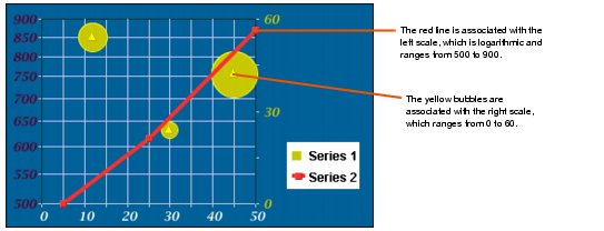
Time Combo graphs can also take advantage of dual y scales. When you use dual y scales, there will be scales on both sides of the graph. Each data series is associated with either the y scale to the left of the graph or the y scale to the right of the graph. The two y scales operate independently of each other.
This means, for example, that if all of your y values in the data series associated with the left scale are less than 60, while all of your y values in data series associated with the right scale are in the hundreds, the left scale will range from 0 to 60, while the range of the right scale will be much larger. It's almost as if you were showing two separate graphs.
The image below shows how a dual y scale graph works. It is of an X-Y Combo graph, but the principle is still the same.

To create a Dual Y Scale graph in PopChart XML, you should set the SubType attribute of Graph to Dual Y. The tag below shows how this is done.
<Graph Name='graph' Type='XY' SubType='Dual Y'>
To associate a series with the left or right y scale, you will need to override its SeriesDefinition element. You should set the Scale attribute for the SeriesDefinition to either Left or Right.
For example, suppose we want to associate the third data series in our graph with the right scale. Inside of our graph element, we use the following SeriesDefinition subelement.
<SeriesDefinition Number='3' Scale='Right' />
The Time Bubble subtype is discussed in the "Bubble Graphs" section.