|
|
Data Organization | PopChart Server Reference 4.0.5 |
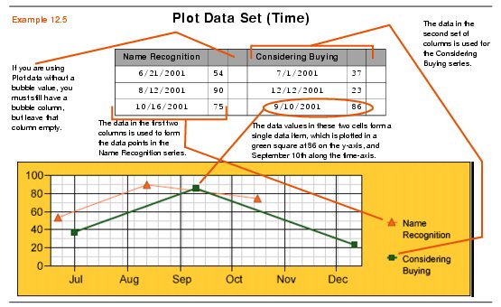
When organizing a Plot data set in a spreadsheet format, each series of data will consist of three columns. For example, the first series consists of the data values in the first through third columns, the second series consists of the data in the fourth through sixth columns, and so on.
The first row of the spreadsheet is reserved for series names. The name for each series will appear in the first column for that series, while any remaining cells in the first row should be left blank. All other rows represent individual data items. In the first column for the series, you should place the x or date value for the data item. In the second column for the series, you should place the y value for the data item. You should leave the third column empty unless you are plotting bubble values.
Example 12.5 illustrates a typical Plot data set in a spreadsheet.

Note: For information about how to format dates in Time plot graphs, you should refer to "Date Input Format (Time Plot)" in Chapter A of the PopChart Builder User Guide.
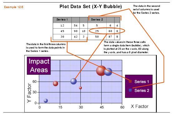
Any graph that uses a Plot data set can become a bubble graph by inserting values into the third column of for the series (the first series consists of columns one to three, the second series consists of columns four through six, etc.). This third column will contain bubble values for each data item.
Example 12.6 illustrates a Plot data set with bubble values.
