|
|
Graph Types | PopChart Server Reference 4.0.5 |
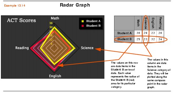
Radar graphs, for the most part, act like Line graphs. However, they are unique in that they use a radial grid to display data items. In a radial grid, the scale value grid lines circle around a central point, which represents zero. The further away a data item is from this center point, the higher its data value. The graph type is called Radar because it looks a lot like a radar screen.
The grid is not entirely circular, rather it is an equilateral polygon, with each category being plotted at a point of the polygon. Thus, if there are three categories, the grid is triangular. If there are eight categories, it will be octagonal. There must be at least three categories for a Radar graph to make sense.
Like in a line graph, all data items in a data series are connected by a line. However, since the grid is circular, the line segments come together to form a polygon. The area inside of the polygon for each series will be colored translucently. This first of all gives you an idea of the total "size" of a data series. Secondly, since it is translucent, you can still see the data series underneath the data series you are looking at.
Example 13.14 below shows a Radar graph works.

Radar graphs are in the Standard Data Class (see Chapter 12 for details). To create a Radar graph with PopChart XML, create a Graph element and set its Type attribute to Radar, as shown in the example below.