|
|
Graph Types | PopChart Server Reference 4.0.5 |
Pareto graphs can be used for:
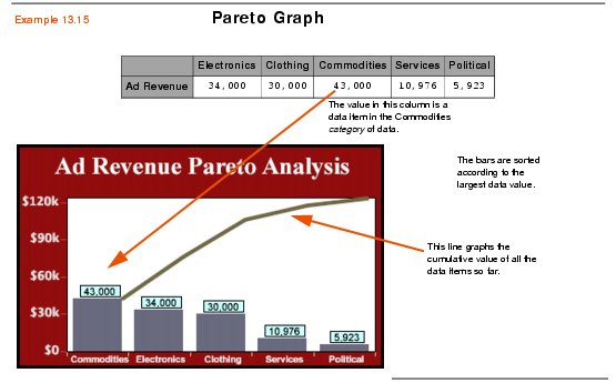
Pareto graphs (pronounced pa-ray-toe) are single-series bar graphs, where the categories are ordered according to the size of their data item (largest to smallest). A line above the bars shows the cumulative value of all of the data items so far. A pareto graphs has two scales—one on the left which shows the actual data values, and one on the right which measures percentages of the total value of the data series.
Pareto graphs are useful for discerning the impact of certain categories of data on a data series. They allow you to quickly see which categories contributed the most (or least) to the entire series.
Example 13.15 below shows a Pareto graph works.

Pareto graphs are in the Standard Data Class (see Chapter 12 for details), but they only graph one data series. To create a Pareto graph with PopChart XML, create a Graph element and set its Type attribute to Pareto, as shown in the example below.