|
|
Graph Types | PopChart Server Reference 4.0.5 |
Gauges are used to indicate where a single data value falls within a predefined set of ranges. For example, suppose you had a gauge for a student's grade on an exam. The gauge might have the following set of ranges: A (90-100), B (80-90), C (70-80), D (60-70), and F (0-60). If the students score were 85, the gauge would indicate that the score was a B. Likewise, if the student's score were 54, the gauge would indicate that the score was in the F range.
Because gauges only graph a single data item, they are very different from other graphs (in fact, most people would say that they aren't graphs). You cannot, for example, import gauge data from a spreadsheet. The concepts of series and categories are also irrelevant.
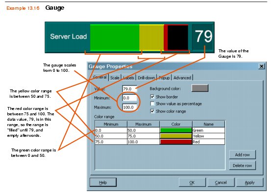
PopChart XML and PCScript have special functions for setting gauge values and ranges (refer to "Gauge Data Class"). In PopChart Builder, you will be able to set these values in the Graph Properties dialog. Example 13.15 shows how the different elements of this dialog are used to form a gauge.

Note: When you have overlapping ranges, the data value will be in the range whose minimum value is closest to the data value. For example, if you have a green range from 80 to 130, and you have a red range of 93 to 110, a data value of 94 would be considered to be in the red range. If the data value falls in a gap between ranges, the gauge will indicate that it was in no range.
To create a Gauge with PopChart XML, create a Graph element and set its Type attribute to Gauge, as shown in the example below.